Wedding Cards
introduction
During the early stage of our wedding preparation, we sent out a paper wedding invitation to our guests; however, after hearing about the experience of other couples, we fear that guests would keep asking the information about the wedding due to some reasons.
In an attempt to avoid answering the basic questions over and over again, we thought that it may be useful to make some light reminders about the wedding for our guests.
time
Sept - Oct 2017
role
UX Researcher
Visual Designer
PROCESS
Timeline
Click an icon for quick access to the corresponding part of the process.
Discover
What are the reasons that guests keep asking for the information? Despite the fact that the wedding invitation already contains the information they need.
According to others' experience, the main reasons are as below:
1. Some guests lost their invitations.
2. Some would like to arrange their schedules, but they don’t have the invitations on hand.
3. Some of them don’t receive an invitation because of some delivery problems.
Research
In order to provide the best reminder for our guests, we interviewed some of our friends.
1. What kind of reminders they won’t ignore?
2. Which form do they prefer?
3. What is an effective way to inform people?
Most of them thought that a decent reminder should have characteristics as below:
photo
They suggested that we can use our photos because a graphic reminder is more helpful than the one full of words. Moreover, pictures help people realize that the reminder is about us at first glance.
They also said that the information should be as simple as possible; it will help people to focus on the essential information.
digital type
It seems unnecessary to make more paper notifications since we have already sent a wedding invitation.
At the present time, most people have electronic devices to check information. Thus it will be more useful to have a digital version of a reminder.
To be more specific, sending a digital wedding card by e-mail will be a fabulous idea.
Time
Nowadays, a lot of people are busy and forgetful, so the reminders should be one month and three days ahead of the wedding date respectively.
The first one is used for reminding guests of checking their schedules, and the second one will be used to inform them of more specific information and some temporary adjustments.
design
Normal Form
A wedding invitation usually includes information about the names of the couple, date, time, location and also a photo of the couple as a symbol; however, if we want to make it a light reminder, this form is too detailed.
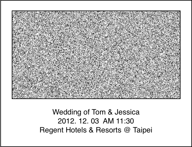
Normal Form
Modified
In light of suggestions from our friends, the first wedding card is used to remind guests of checking their schedules. Therefore, the information should be as simple as possible, so I should only leave the names and the date on it; others can be omitted.
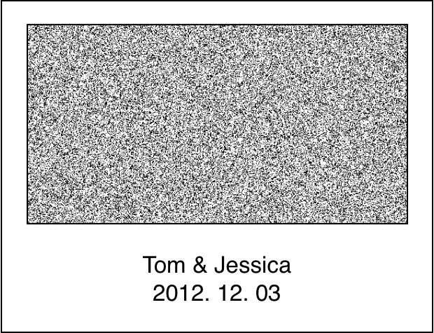
Modified
Prototype
The first one will be sent out one month ahead of the wedding date, and it is used to remind people of checking their schedules, thus this wedding card does not include specific details.
As for the prototype of the second wedding card, I decided to do it after I received my friends’ suggestions about the prototype of the first one.
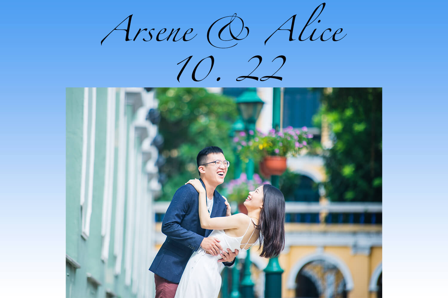
Prototype
feedback
When I finished the first one, I delivered it to some of my friends. They thought that this one was not perfect since it somehow looked a little dull even though it included the basic ideas.
They suggested that I can use Photoshop to make it fancier; in this way, people might be willing to take a good look at it instead of putting it aside immediately at first glance.
The 2nd version of the first card
According to friends’ advice, I used Photoshop to modify the picture.
The main modifications are removing the background of the original picture to make it brighter.
Also, I blended a city view with our bodies to make the card more unique to catch recipients’ eyes.

The 2nd version of the first card
The design of the second card
The second card should include more information than the first one; therefore, I added the specific time and location on it.
Just like the first one, I used Photoshop to make the card more attractive.
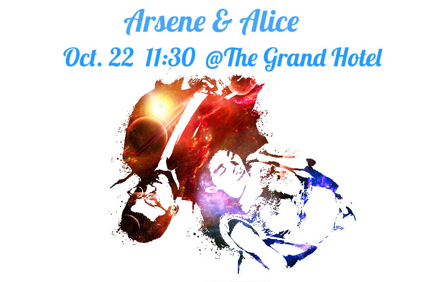
The design of the second card
release
After I finished the above designs of these two cards, I used them as the final design and sent them by e-mail since I did not have more time to modify them further.
In the end, there were only 5 people ( out of 231 guests ) asking for the information about the wedding:
2 of them rearranged their schedules and decided to attend our wedding after we sent the digital wedding cards
2 of them did not check their e-mail box
1 of them left the wrong e-mail address to us